Rent Cart Redesign l 5 min read
When the Cart Wasn’t a Cart
How reframing checkout drove a +100% increase in multi-item orders
OVERVIEW
Rentit’s cart functioned like a static wishlist, limiting users to single-item rentals and obscuring final pricing. This project restructured the rental flow around dates, transforming it into a true checkout system that enabled multi-item rentals.
The impact:
Multi-item rentals: +100%
Average items per order: +30%
Checkout abandonment: –15%
MY ROLE
Product Designer
TEAM
1 Product Manager
1 Product Designer
3 Engineers
2 Analytics
TIMELINE
Feb 2023 - Jun 2023
(4 Months)
PROBLEM
Rentit’s cart forced users to complete one rental at a time, preventing multi-item rentals for the same period.
Why the Old System Failed
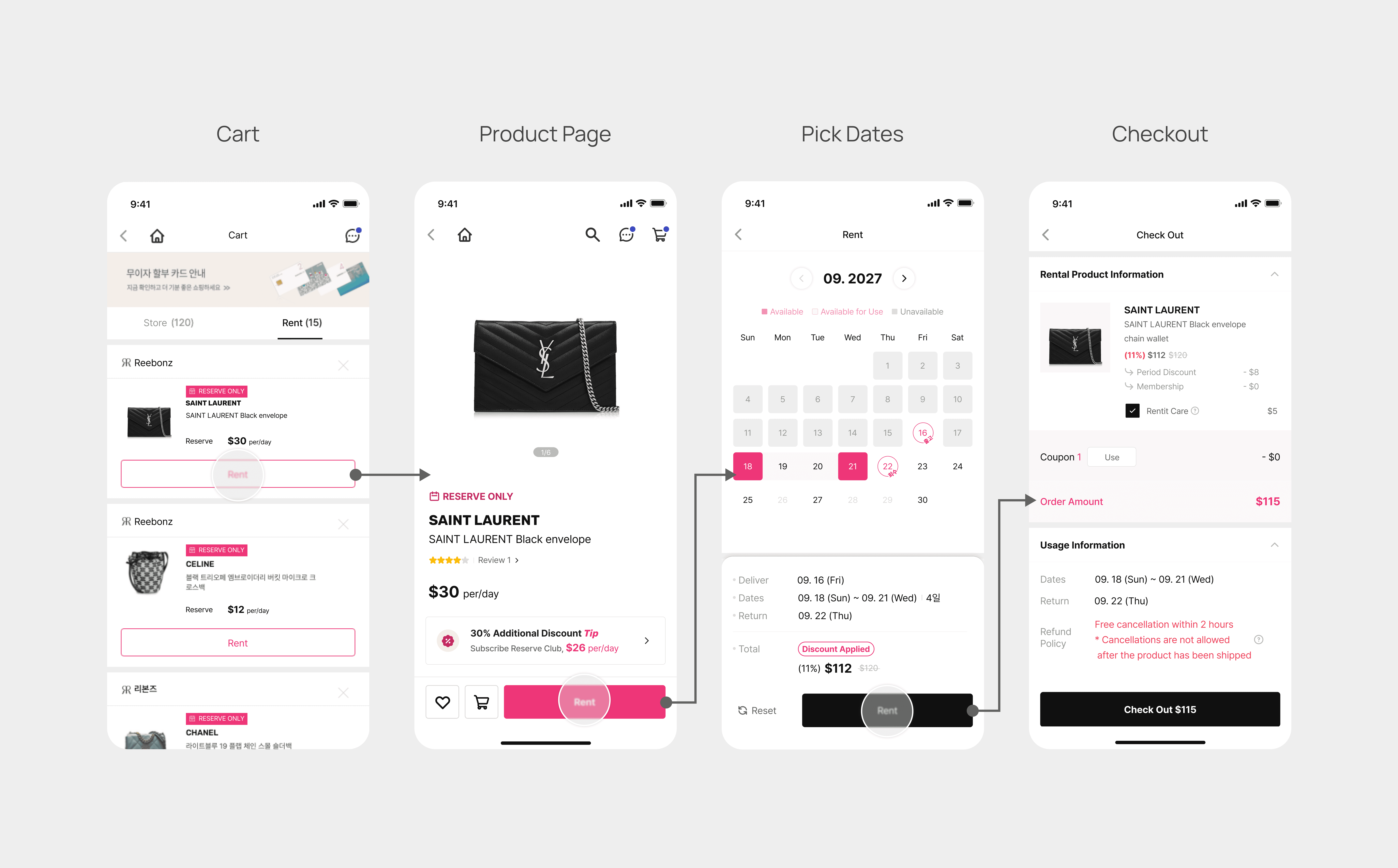
01. A Loop Instead of a Checkout
Users had to: Add → Pay → Repeat for items within the same rental period.
Before Flow
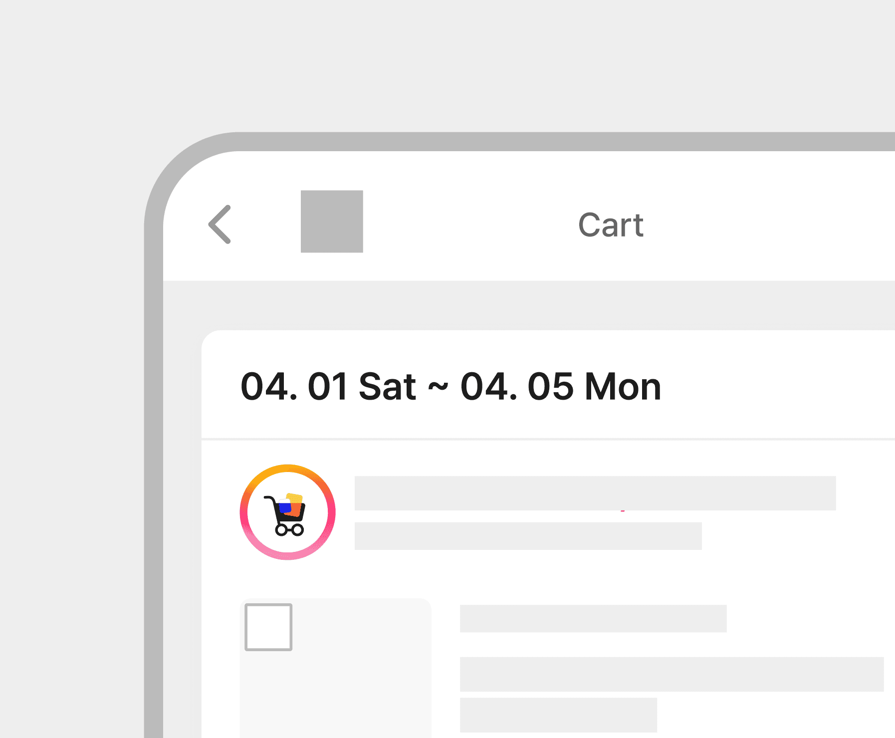
02. Total Cost Appeared Only at Checkout
Users could see daily rates, but the full rental cost was revealed at the final checkout step.
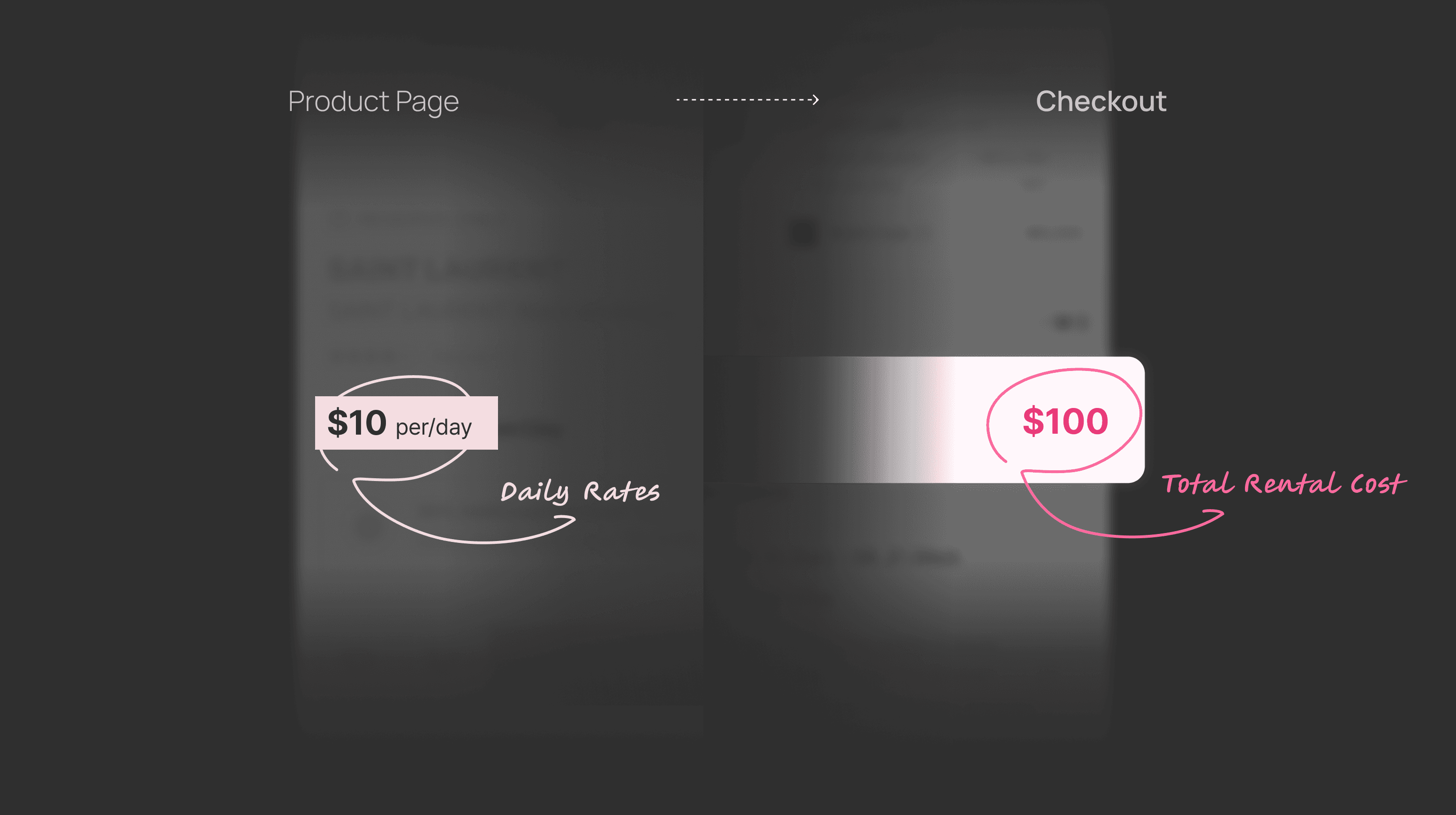
Total rental cost was only clear at the final checkout step
03. No Logic for Bundling
Without anchoring rental dates first, the system couldn’t support bundling multiple items in a single checkout.
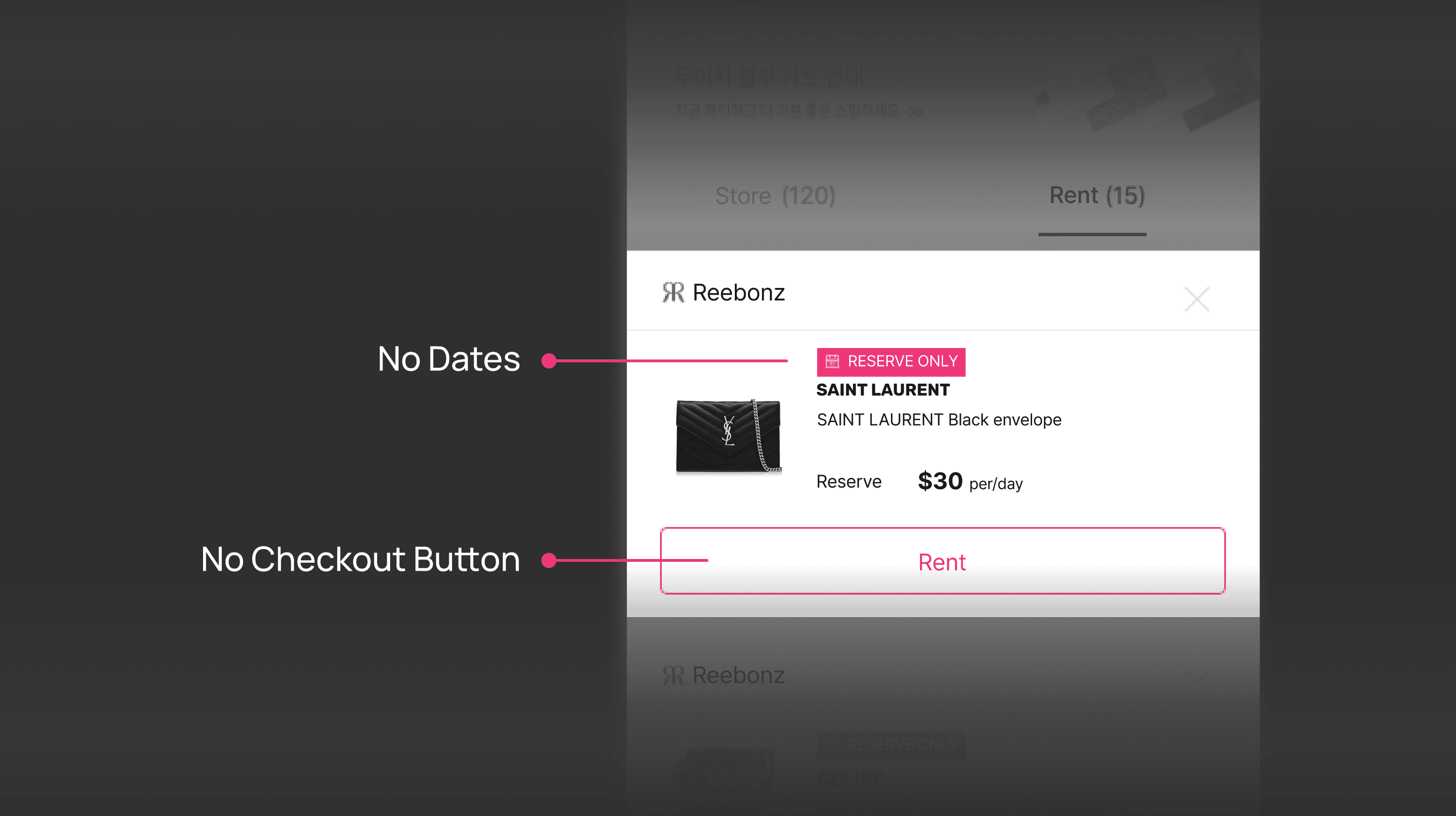
With no dates anchored, users were blocked from adding more items to this cart

Although 86% of orders were single-item, 61% of multi-item customers were forced to split transactions for the same rental period.
Design Goal
STRATEGY
Designing a Cart for Time,
Not Inventory
The original cart treated rentals like retail purchases (item-first).
But rental pricing and availability depend on dates, not items.
In rental, without a date, an item has no availability and no price.
The Old Way
Item-First Model (like Retail)

The New Way
Date-First Model (like Hotel Booking)
DESIGN DECISIONS
Visualizing Discounts
Without Breaking the Flow
We simplified checkout by removing the promo page.
But we still needed to surface incentives to support revenue goals.
The challenge was balancing user clarity with business visibility.

❌ Low Visibility
Too subtle. Users often scrolled past without noticing the incentive.
❌ Ambiguous Meaning
Too abstract. Users failed to connect the circle icon to 'savings progress'
🟢 Intuitive Gamification
Clear visualization. The linear bar naturally nudged users to 'fill it up' for the reward
SOLUTION
Redesigned the Flow
to Support "Dates-First" Logic
I restructured the architecture so users define "When" before committing to "What."

After Flow
Key Structural Changes
01. Smart Action Placement
Moved the "Add to Cart" trigger inside the calendar, ensuring users commit to a rental period first.
Anchored dates to ensure availability
02. Upfront Transparency
Anchoring dates early allows final prices to be displayed immediately, eliminating price shocks.
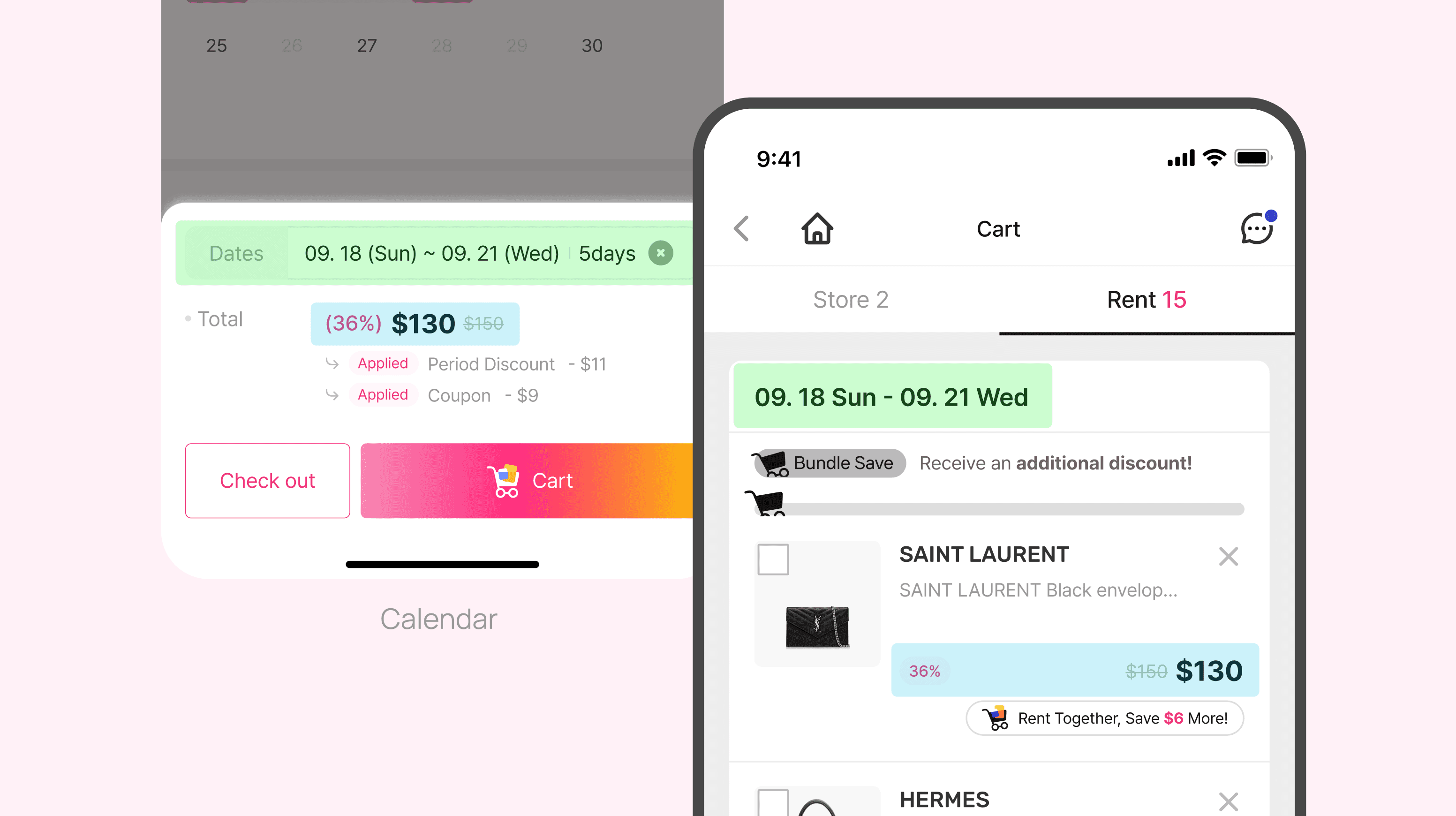
Total costs shown upfront, no hidden math
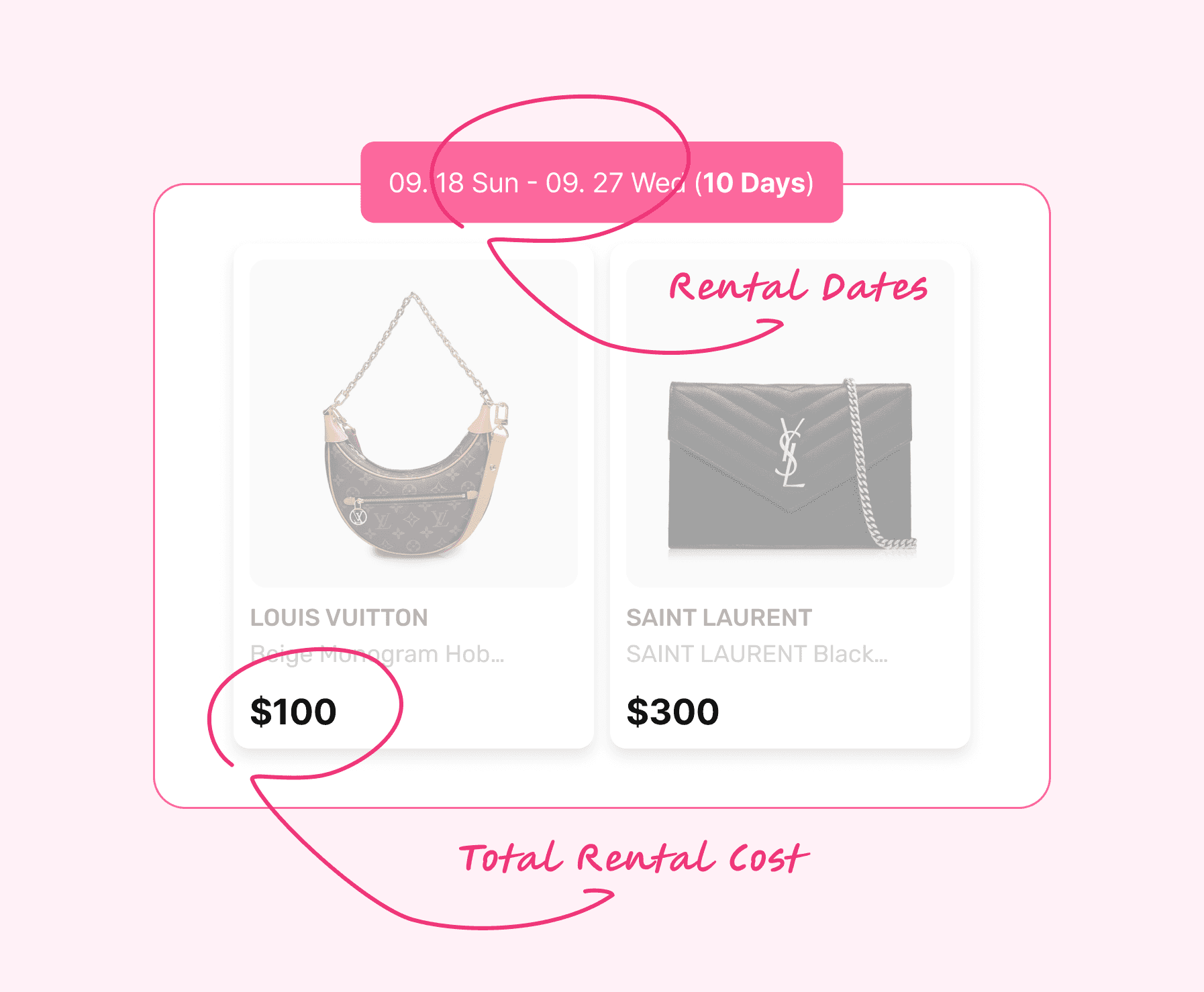
03. Seamless Bundling
Users can naturally stack multiple items with overlapping dates into a single transaction.
Frictionless multi-selection with instant feedback
POST-LAUNCH ITERATION
Users Abandoned the Flow
When Their Selected Dates Disappeared
Metrics improved, but abandonment remained slightly above target. Session Replays revealed the culprit.
The Insight
Users Expected Their Selected Dates to Follow Them
However, the system treated every page load as a new visit, wiping out their progress and forcing them to start over.
Step 1: User filters items by date (09.18 - 09.22)

Step 2: But dates disappear upon clicking a product

Upgraded date selection to a global session constraint that persists across the journey.
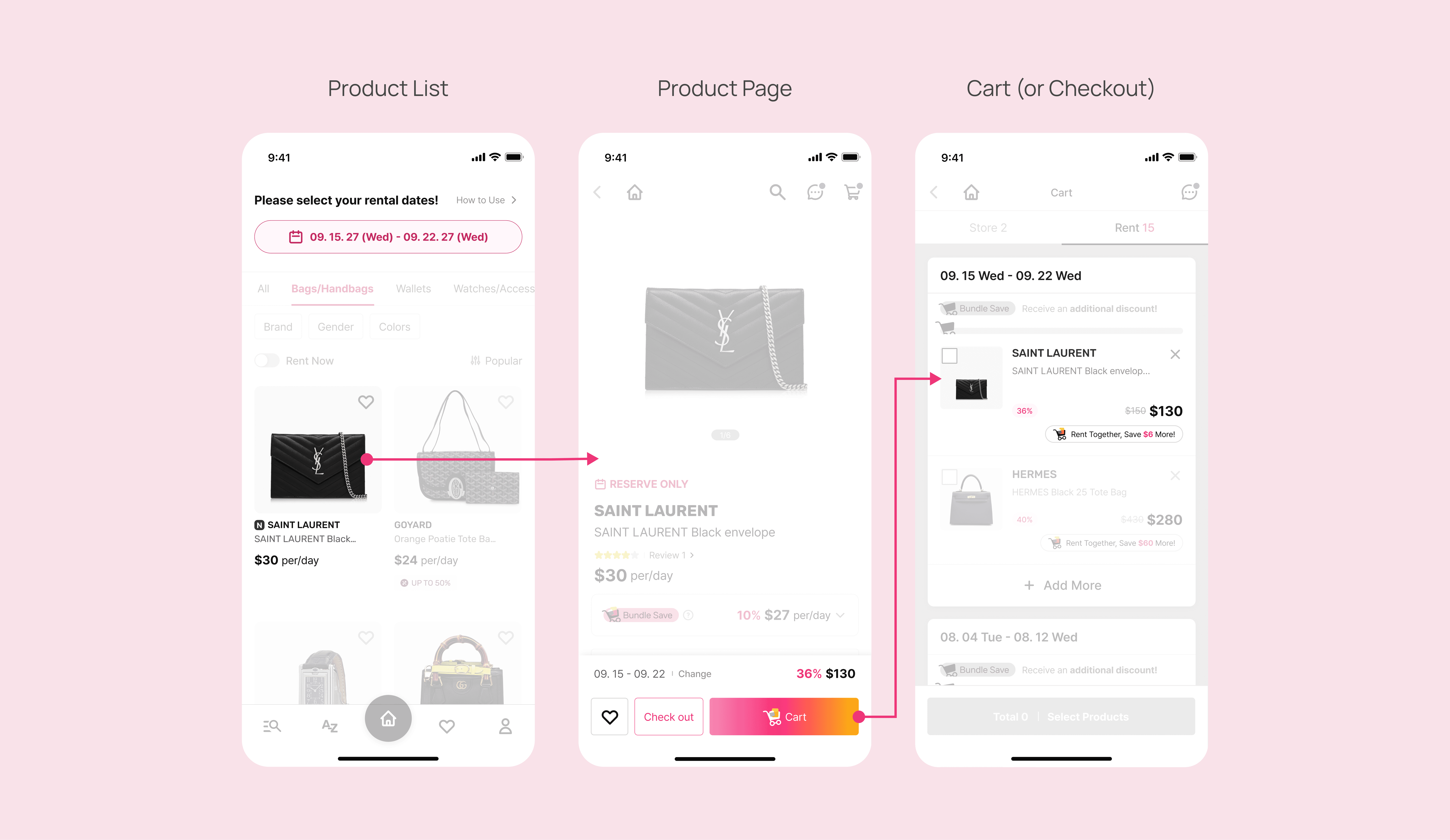
After Flow

Visual Confirmation on Product Page
IMPACT
We unlocked suppressed demand by removing structural friction. The surge in multi-item rentals proved that users always had the intent to bundle. The system just needed to get out of their way.
Multi-item Rentals
Average Items per Order
Checkout Abandonment Rates
KEY TAKEAWAYS
Redesigning the Experience,
Not Just the Cart
Fixing the interface required restructuring the underlying business logic (Retail vs. Rental) first. I learned that constraints in the UI are often symptoms of conflicts in the system rules.
Smarter Systems
Over Smoother Flows
Alignment proved to be more powerful than polish. Shifting the logic from "Shopping" to "Booking" demonstrated that matching the system to the user's mental model is the foundation of a seamless experience.
You May Also Like

